

OKKIA
AI picks glasses to suit a face, and lets you try them on online
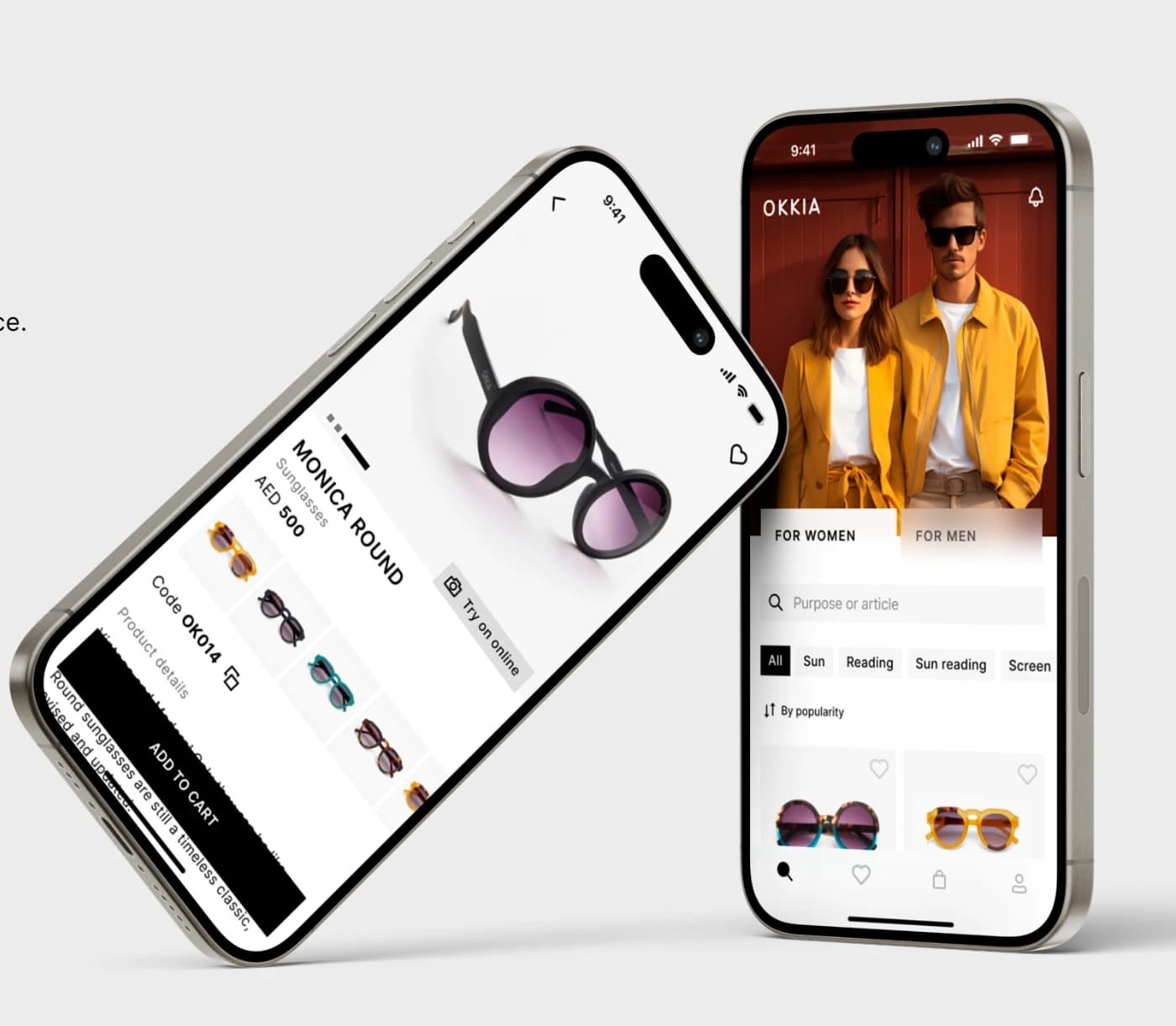
The catalogue is the storefront's main screen: both the site and the app open on it. It splits into women's and men's lines, and the season's cover photo sits above the grid — a shoot in the frames that leads straight into the edit.
Filters are grouped by purpose — sun, reading, sun reading, screen — and work alongside search by article and sorting by popularity, newness and price. A card shows the frame in every colour, the price and a heart for favourites: a shortlist can be built without opening a single product.
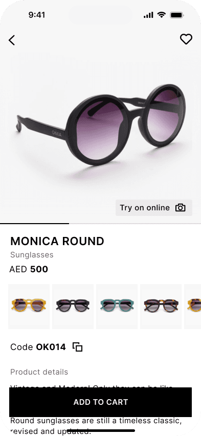
A product card takes the whole screen: a large photo of the frame, its name, article and price, neighbouring colours in a strip below, a "Try on online" button next to the photo and "Add to cart" pinned at the bottom. Catalogue to purchase is two taps.
The same principles carry into the app: an easy, pleasant and understandable interface. From the home screen a person lands straight in the catalogue — products are convenient to sort and look through, with nothing extra to open.
The "Virtual try on" tile sits inside the product grid rather than hidden in a card — the try-on catches the eye while a person is still scrolling.

The storefront is put together as an advertising surface. The first screen is given to a full-width campaign: the shoot, a slogan over it and a line that leads on. "The Face Guide" — a guide to face shapes — stands where the seasonal edits Reading Shop and Sun Shop do: content and product lie in the same feed.
The app follows the same logic: the launch screen and the catalogue cover are given to the campaign, and promo tiles stand inside the grid. Shoot and slogan drop into places already prepared for them, so changing a campaign is marketing's work, not development's.

The try-on opens over the catalogue and never breaks the purchase: a person sees themselves in the frame, moves through neighbouring models in the strip below and adds the one they like to the cart.

We produced the design concept for OKKIA's digital storefront: a site and a mobile app where face-based selection, online try-on and the room for a campaign sit inside the catalogue itself.