

Anastasia Lugovaya
UI/UX Designer
Reading time: ~ 4 min
October 21, 2022
Anastasia Lugovaya·UI/UX Designer·Reading time: ~ 4 min·October 21, 2022
UI animation: how does it help the user?
Animation is now part of almost every website and mobile app interface. It plays a key role in usability — essentially the interface’s language for communicating with the user. The system shows which buttons are clickable, where to tap, that nothing is frozen, and that a page is loading. That communication can take many forms depending on functionality and designers’ ideas. To add animation that truly improves familiarity and ease of use, you need to know how it helps the user. We asked our UI/UX designers for the main examples where animation improves interaction with the interface.
Highlighting key actions
Animation can draw attention to a key element, showing that it can or should be interacted with, and can also reflect a successful action. A common example: when you tap Send, the button becomes a duller color, telling the user the action was completed.
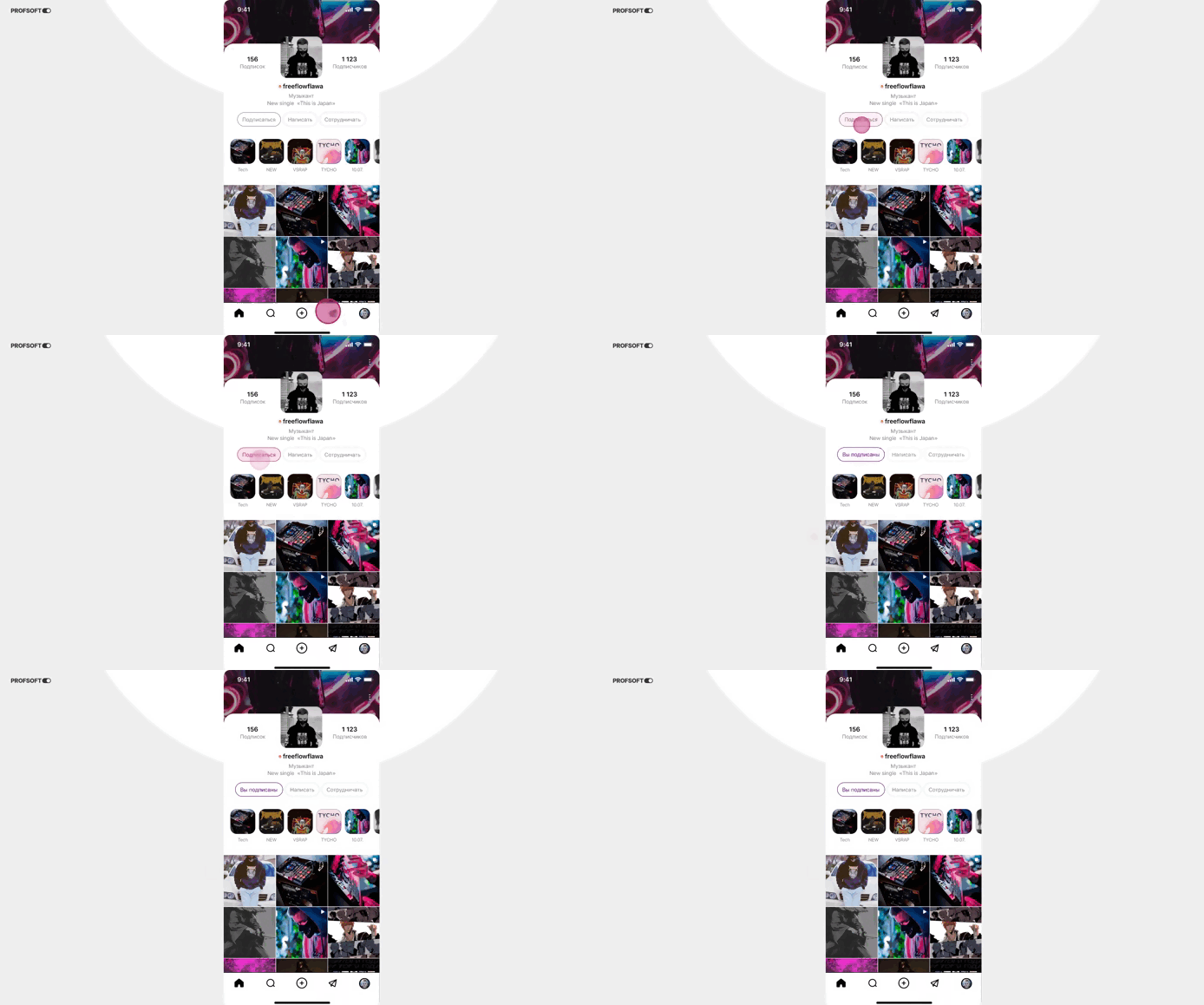
Building mental models
Transition animation appears when switching between screens or apps, or when expanding and collapsing menus. Through it, users grasp how the interface is organized and how to move through it, which helps them orient themselves more easily and efficiently.
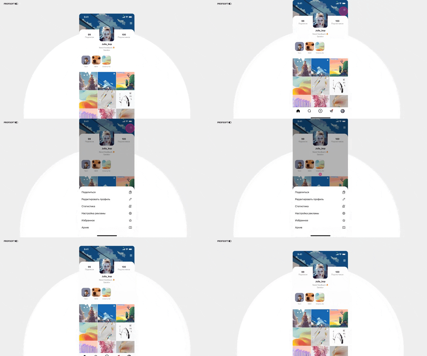
Feedback
Showing loading or task progress keeps the user informed that their command is being executed. So they are not left wondering whether the system responded or how long to wait, interfaces use progress bars that fill as work completes and may show the stage of completion. You may also see spinners when opening heavy files, or button size or color changes on tap. Feedback animation makes the interface feel active and responsive.
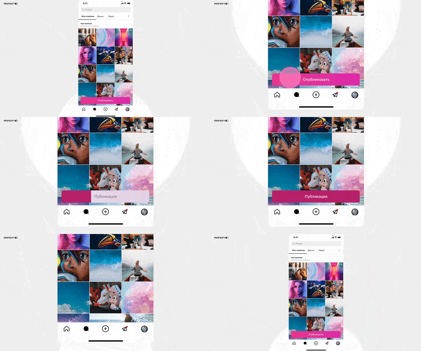
Action preview
When dragging an element, we see it follow the cursor. Sometimes we only see the action in progress; sometimes we preview the result if we drop the element. For the same reason, hover zoom on images helps decide whether to open them.
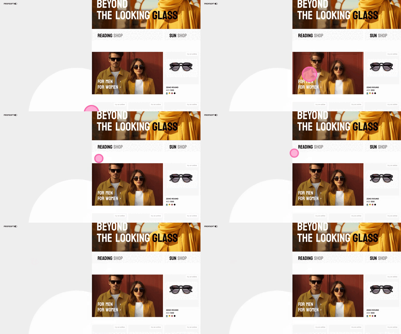
Showing what is changing
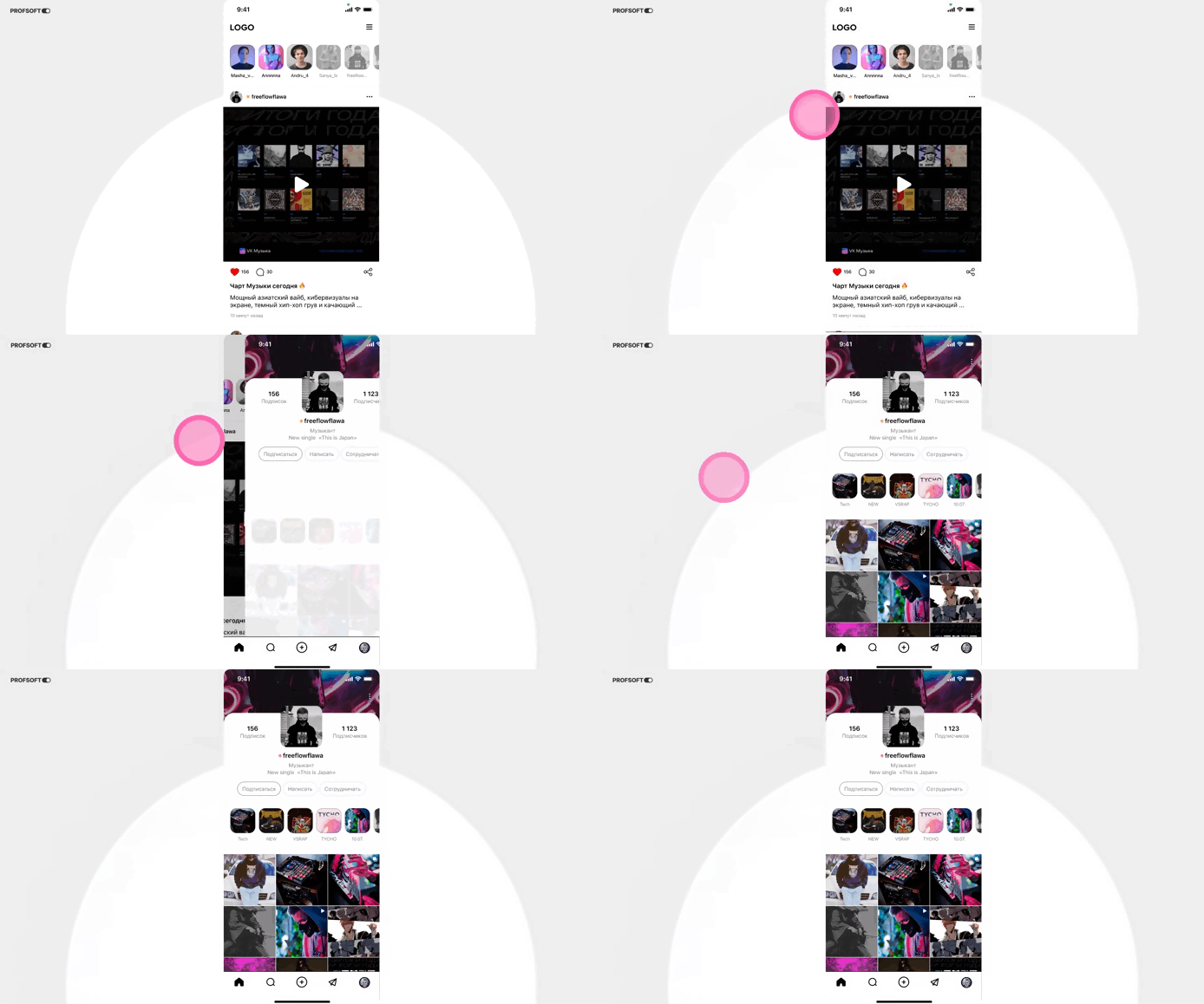
Animation can make transitions between states smoother and more natural. For example, switching tabs can show which content leaves and which appears, making the change easier to understand. Another example is notification badge animation that signals new messages.
Visual cues
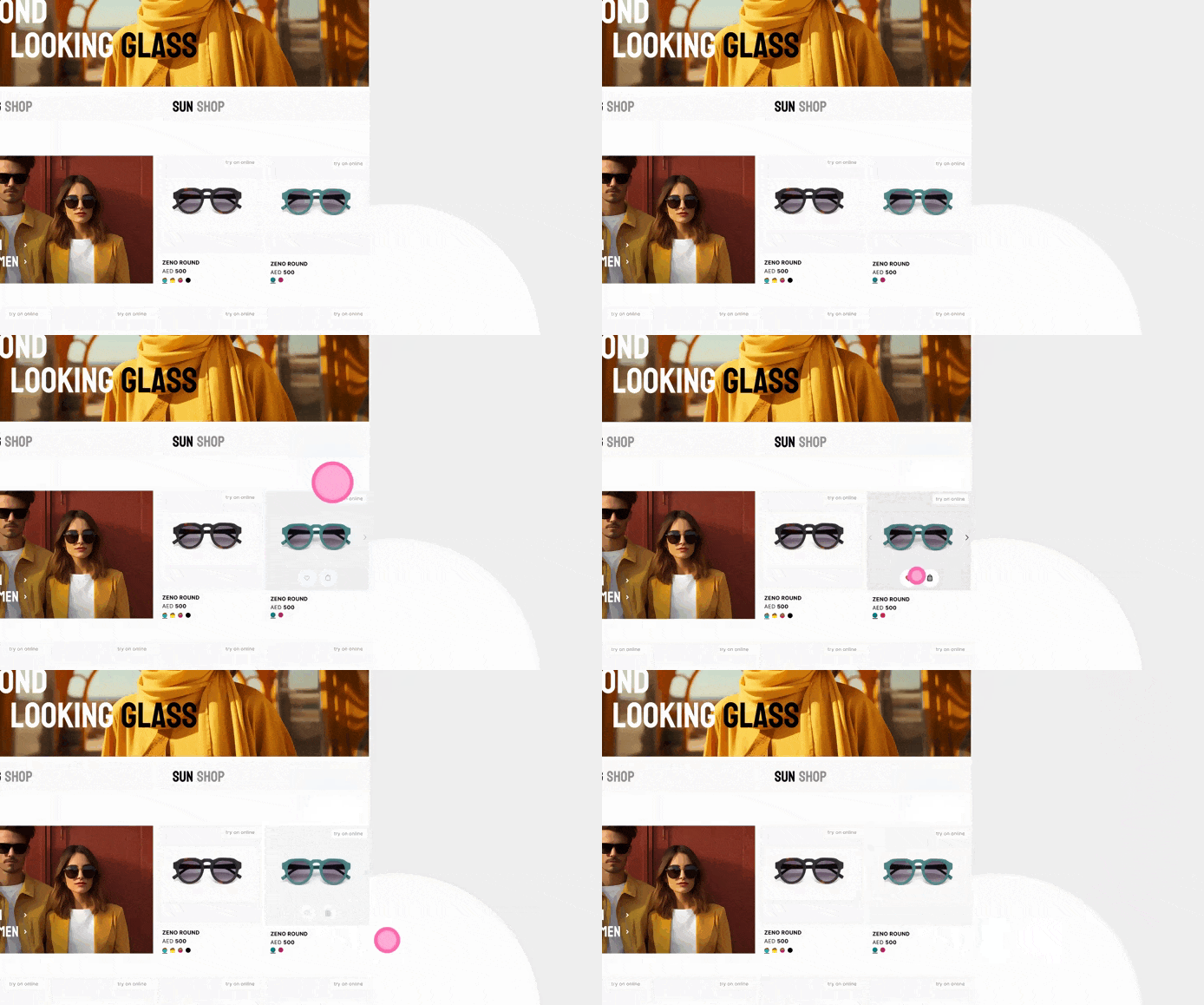
A new interface is hard to navigate, so the goal is to make an unfamiliar structure easier to learn. Visual cues act like signposts on an unknown route — a button changing on hover or extra controls appearing to show it is active. Users learn which controls are interactive and how to use them.
Conclusion
Imagine an interface without animation: where do I tap? Where did this window come from? What about this tab? Is the app frozen? Did the button register or do I tap again? That is why animation is added — to explain, guide, and keep users aware of what changes as they interact. In our case studies we often use animation to improve the user experience.